
Hello everyone,
nearly a month after i posted this topic the work is done so far. The new homepage is based on dokuwiki with a costum template.
Take a look at http://minetest.net
PS: If you are a nostalgic person, you can still visit the old homepage under http://c55.me/minetest2
FOSS gamedev and creative worlds
This is a mostly frozen copy of the Minetest forums through 2017. If you know phpBB3 and would like to host any G-rated forum here, you can email: me@minetest.org If the email doesn't work, find out who's taken over Final Minetest from OldCoder and email them to get write access or an admin account.
I should have set this up years ago. But it's no tale of woe.
Whether the temperature is high or low, regardless of cold winds blow,
away we go like Edgar Allan Poe, on now with the show. BTW rhymes are welcome.
A new Homepage!
43 posts
• Page 1 of 2 • 1, 2
A new Homepage!
Last edited by BlockMen on Wed Apr 10, 2013 19:22, edited 1 time in total.
-

rubenwardy - Member
- Posts: 4500
- Joined: Tue Jun 12, 2012 18:11
- GitHub:
rubenwardy
- IRC: rubenwardy
- In-game: rubenwardy
Last edited by rubenwardy on Thu Mar 14, 2013 19:06, edited 1 time in total.
Like my stuff? Tip me a coffee | My Twitter
Mods: Awards - 15 more
Tools: Node Box Editor Mt Mods 4 Android
online book teaching how to mod
Mods: Awards - 15 more
Tools: Node Box Editor Mt Mods 4 Android
online book teaching how to mod
- celeron55
- Member
- Posts: 430
- Joined: Tue Apr 19, 2011 10:10
However nice it is, I can't really accept a logo text that is so similar to MC's on the site. Unless there is proof that it already is a commonly used style and not unique at all to MC. (note: already replaced in the original post)
Otherwise, I must say this is somewhat tasteful. That particular white background could even work as the style for in-game menus, which could make an interesting unified style.
Do you think there is anything you can do to the logo text (or whatever it might be called)?
Otherwise, I must say this is somewhat tasteful. That particular white background could even work as the style for in-game menus, which could make an interesting unified style.
Do you think there is anything you can do to the logo text (or whatever it might be called)?
Last edited by celeron55 on Fri Mar 15, 2013 15:26, edited 1 time in total.
- Josh
- Member
- Posts: 1146
- Joined: Fri Jun 29, 2012 23:11
Look's like a great new homepage but make the logo text made out of mese nodes.
That way it will be different from minecraft's
That way it will be different from minecraft's

Make it out of Mese Crystals.
( ͡° ͜ʖ ͡°) ( ͡o ͜ʖ ͡o) [$ ( ͡° ͜ʖ ͡°) $] ( ͡$ ͜ʖ ͡$) ヽ༼ຈل͜ຈ༽ノ
My image and media server is back online and is functioning as normal.
celeron55 wrote:However nice it is, I can't really accept a logo text that is so similar to MC's on the site. Unless there is proof that it already is a commonly used style and not unique at all to MC.
Otherwise, I must say this is somewhat tasteful. That particular white background could even work as the style for in-game menus, which could make an interesting unified style.
Do you think there is anything you can do to the logo text (or whatever it might be called)?
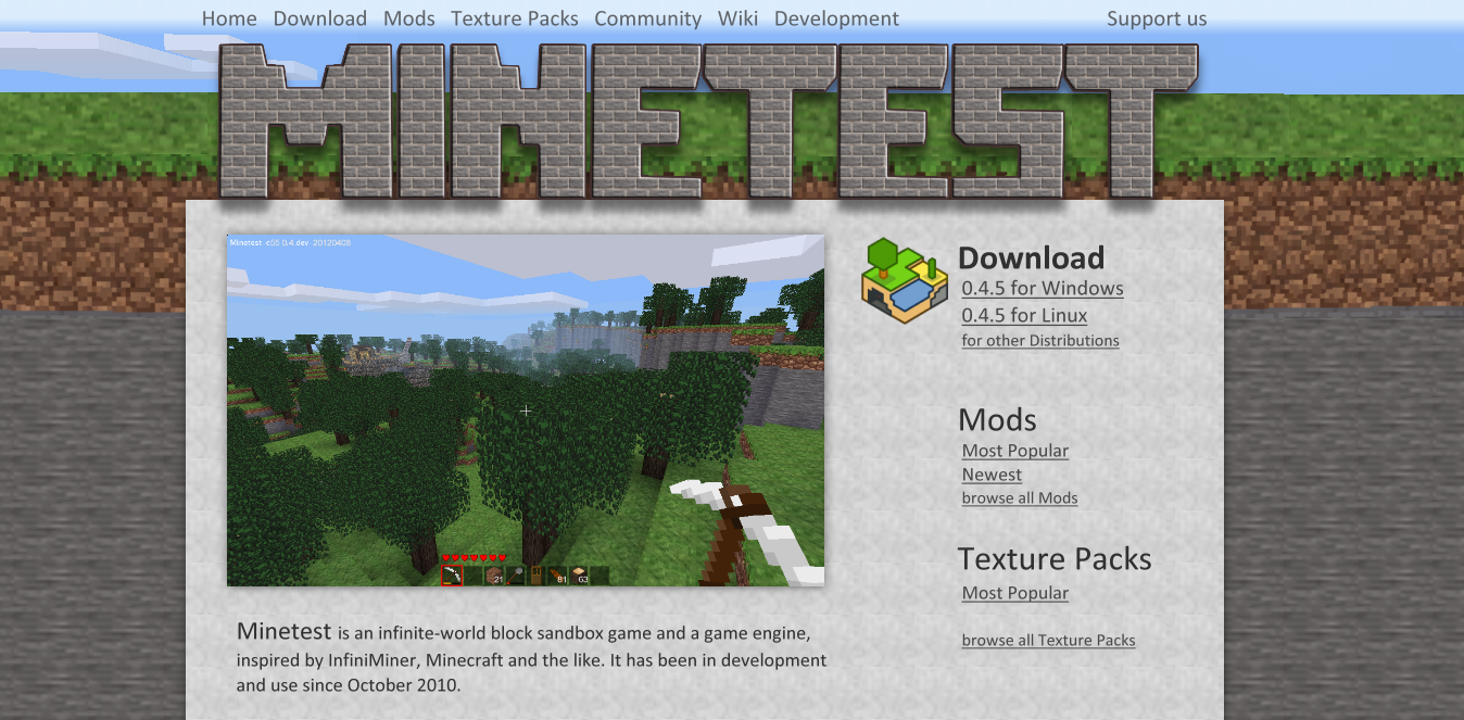
I have created a new logo text now, that doesn't look that similar to MC's. Of cause it can still be improved, but i wanted to get the main structure first.
Would you say it is ok that way?
Last edited by BlockMen on Fri Mar 15, 2013 10:28, edited 1 time in total.
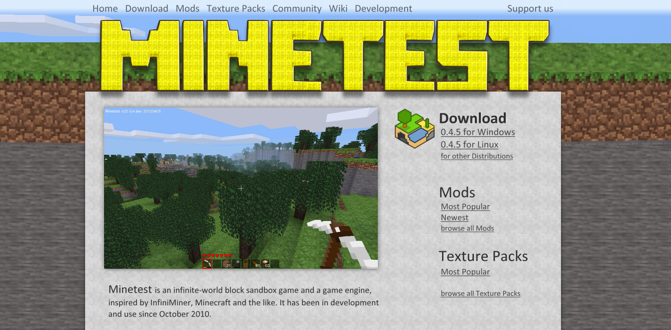
Josh wrote:Look's like a great new homepage but make the logo text made out of mese nodes.
That way it will be different from minecraft's
Jordach wrote:Make it out of Mese Crystals.
I don't think that this is a good idea. I will make a concept with it anyway, but in my opinion it looks to much "gold".
EDIT: It looks better than i thought.
Last edited by BlockMen on Fri Mar 15, 2013 10:28, edited 1 time in total.
- prestidigitator
- Member
- Posts: 632
- Joined: Thu Feb 21, 2013 23:54
Hey, if the name were changed to "Mesetest" it might help escape the whole Minecraft comparison. ;-)
-

Likwid H-Craft - Member
- Posts: 1113
- Joined: Sun Jan 06, 2013 14:20
Hey c55, what if the logo looked like the Mese Pickaxe, looked like mining test? since it called Minetest.
Last edited by Likwid H-Craft on Fri Mar 15, 2013 11:29, edited 1 time in total.
My Domain's/others:
http://likwidtest.hj.cx/ (Not Done)
http://likwidtest.hj.cx/ (Not Done)
-
rubenwardy - Member
- Posts: 4500
- Joined: Tue Jun 12, 2012 18:11
- GitHub:
rubenwardy
- IRC: rubenwardy
- In-game: rubenwardy
prestidigitator wrote:Hey, if the name were changed to "Mesetest" it might help escape the whole Minecraft comparison. ;-)
Or its original name, "Mesetint".
Like my stuff? Tip me a coffee | My Twitter
Mods: Awards - 15 more
Tools: Node Box Editor Mt Mods 4 Android
online book teaching how to mod
Mods: Awards - 15 more
Tools: Node Box Editor Mt Mods 4 Android
online book teaching how to mod
-
rubenwardy - Member
- Posts: 4500
- Joined: Tue Jun 12, 2012 18:11
- GitHub:
rubenwardy
- IRC: rubenwardy
- In-game: rubenwardy
Likwid H-Craft wrote:Hey c55, what if the logo looked like the Mese Pickaxe, looked like mining test? since it called Minetest.
I like the logo as it is.
The block banner on this website design would look good with a steel pick axe rest against it.
Like my stuff? Tip me a coffee | My Twitter
Mods: Awards - 15 more
Tools: Node Box Editor Mt Mods 4 Android
online book teaching how to mod
Mods: Awards - 15 more
Tools: Node Box Editor Mt Mods 4 Android
online book teaching how to mod

rubenwardy wrote:prestidigitator wrote:Hey, if the name were changed to "Mesetest" it might help escape the whole Minecraft comparison. ;-)
Or its original name, "Mesetint".
Mesetint was the former name of minetest_game, not of the engine itself.
- celeron55
- Member
- Posts: 430
- Joined: Tue Apr 19, 2011 10:10
BlockMen wrote:EDIT: It looks better than i thought.
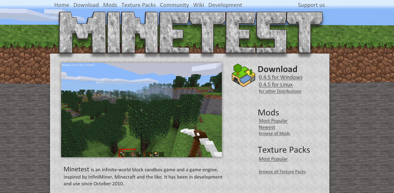
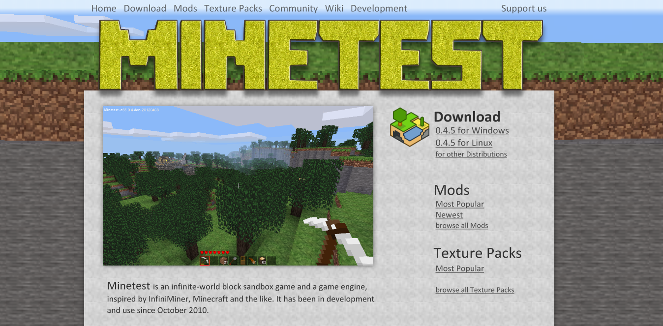
Hmm... I think the grey one looks too bland, and the full mese one looks too bright. Do you think there is a way to do something in neither extreme?
celeron55 wrote:BlockMen wrote:EDIT: It looks better than i thought.
Hmm... I think the grey one looks too bland, and the full mese one looks too bright. Do you think there is a way to do something in neither extreme?
I made new Versions of both:
stone
and Mese
NICE.
( ͡° ͜ʖ ͡°) ( ͡o ͜ʖ ͡o) [$ ( ͡° ͜ʖ ͡°) $] ( ͡$ ͜ʖ ͡$) ヽ༼ຈل͜ຈ༽ノ
My image and media server is back online and is functioning as normal.
- celeron55
- Member
- Posts: 430
- Joined: Tue Apr 19, 2011 10:10
I'm ok with changing the site's layout to the one with the new stone themed title.
It needs a variation of the design for the other pages though, with the title much smaller and the subpage title visible, to make them focus on the content.
It needs a variation of the design for the other pages though, with the title much smaller and the subpage title visible, to make them focus on the content.
- ungali
- Member
- Posts: 21
- Joined: Wed Mar 13, 2013 22:05
- IRC: ungali
- In-game: ungali
What if the central image were a slideshow of community chosen images?
Like: look at what people do in this game.
Like: look at what people do in this game.
Minetest needs better music. And puppies.
celeron55 wrote:I'm ok with changing the site's layout to the one with the new stone themed title.
It needs a variation of the design for the other pages though, with the title much smaller and the subpage title visible, to make them focus on the content.
Nice to hear that. If you need help with realisation, I have experience with PHP, MySql, HTML, CSS and JS.
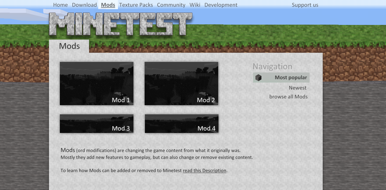
Here is a first concept for a subpage:
Jordach wrote:NICE.
Thanks.
ungali wrote:What if the central image were a slideshow of community chosen images?
Like: look at what people do in this game.
That could be details for later and it would also be possible to make a video, or a slideshow of video(s) and pictures, etc...
- lkjoel
- Member
- Posts: 778
- Joined: Wed Feb 29, 2012 19:27
This is very, very, nice! I really love it :D
My mods: The Nether | Doctor Who (WIP)
I have quit minetest ... again. I am heavily unimpressed by both the game and the community.
I have quit minetest ... again. I am heavily unimpressed by both the game and the community.
- celeron55
- Member
- Posts: 430
- Joined: Tue Apr 19, 2011 10:10
The (somewhat crappy) current minetest.net source code is available here: https://github.com/celeron55/minetest.net_php
There are probably three ways of doing this; either you'll just throw the raw graphics in here and maybe me or rubenwardy will code the layout, or you'll implement a template-ish version of the layout and I'll integrate it on the site, or you'll just go ahead and do it all, and send a pull request. 8)
There are probably three ways of doing this; either you'll just throw the raw graphics in here and maybe me or rubenwardy will code the layout, or you'll implement a template-ish version of the layout and I'll integrate it on the site, or you'll just go ahead and do it all, and send a pull request. 8)
celeron55 wrote:There are probably three ways of doing this; either you'll just throw the raw graphics in here and maybe me or rubenwardy will code the layout, or you'll implement a template-ish version of the layout and I'll integrate it on the site, or you'll just go ahead and do it all, and send a pull request. 8)
I think i will choose the 3rd option. :) Where and how i have to send a pull request?
EDIT: Ok, I found out now. The URL is https://github.com/BlockMen/minetest.net_php, but I guess u already know that.
celeron55 wrote:The (somewhat crappy) current minetest.net source code is available here: https://github.com/celeron55/minetest.net_php
This will help to fit it in the current structure.
Last edited by BlockMen on Sun Mar 17, 2013 17:20, edited 1 time in total.
-

Gambit - Member
- Posts: 452
- Joined: Sat Oct 29, 2011 19:31
I had my go on a redesign awhile ago. The Minetest logo was made by dakal, I only did a minor tweak of it but full credit should still belong to him. The social media icons are from SocialShift by Manuel Lopez.
http://emey87.deviantart.com/art/SocialShift-Social-icon-set-189016080

http://emey87.deviantart.com/art/SocialShift-Social-icon-set-189016080
I dont know if Gambit or BlockMen has a better design..
( ͡° ͜ʖ ͡°) ( ͡o ͜ʖ ͡o) [$ ( ͡° ͜ʖ ͡°) $] ( ͡$ ͜ʖ ͡$) ヽ༼ຈل͜ຈ༽ノ
My image and media server is back online and is functioning as normal.
-

0gb.us - Member
- Posts: 841
- Joined: Sun Sep 16, 2012 01:55
I like Gambit's better, but that's mainly because I've always had a preference for dark colors. BlockMen's design is also very good.
-

Traxie21 - Member
- Posts: 753
- Joined: Mon Dec 31, 2012 10:48
I'd say I like Gambits because it seems to use the space better and dosn't look as much like a blog.
No offense BlockMen.
No offense BlockMen.
My Essential Server Modpack: ServerExtended
Maintainer of the Minitest Game
[0.4.6-git] SunriseTest Minecraft-Like Hardcore Server
My Kindle broke... Online time will drop significantly.
Maintainer of the Minitest Game
[0.4.6-git] SunriseTest Minecraft-Like Hardcore Server
My Kindle broke... Online time will drop significantly.
Traxie21 wrote:I'd say I like Gambits because it seems to use the space better and dosn't look as much like a blog.
No offense BlockMen.
No problem that you like Gambits more. Every opinion is welcome here.
But I don't see why my concept looks more like a blog than Gambits. Actually the "Recent Post"-Box, the "posted in", the date at text and the "Comments" makes Gamits concept look alot like a blog.
-
Traxie21 - Member
- Posts: 753
- Joined: Mon Dec 31, 2012 10:48
I meant the column style long page.
My Essential Server Modpack: ServerExtended
Maintainer of the Minitest Game
[0.4.6-git] SunriseTest Minecraft-Like Hardcore Server
My Kindle broke... Online time will drop significantly.
Maintainer of the Minitest Game
[0.4.6-git] SunriseTest Minecraft-Like Hardcore Server
My Kindle broke... Online time will drop significantly.
Traxie21 wrote:I meant the column style long page.
Summing up: You like the space above and below. Because in relation to the colum style this is the only difference.
-
Traxie21 - Member
- Posts: 753
- Joined: Mon Dec 31, 2012 10:48
I like wider pages :3
My Essential Server Modpack: ServerExtended
Maintainer of the Minitest Game
[0.4.6-git] SunriseTest Minecraft-Like Hardcore Server
My Kindle broke... Online time will drop significantly.
Maintainer of the Minitest Game
[0.4.6-git] SunriseTest Minecraft-Like Hardcore Server
My Kindle broke... Online time will drop significantly.
43 posts
• Page 1 of 2 • 1, 2
Who is online
Users browsing this forum: No registered users and 90 guests